Trend Chart

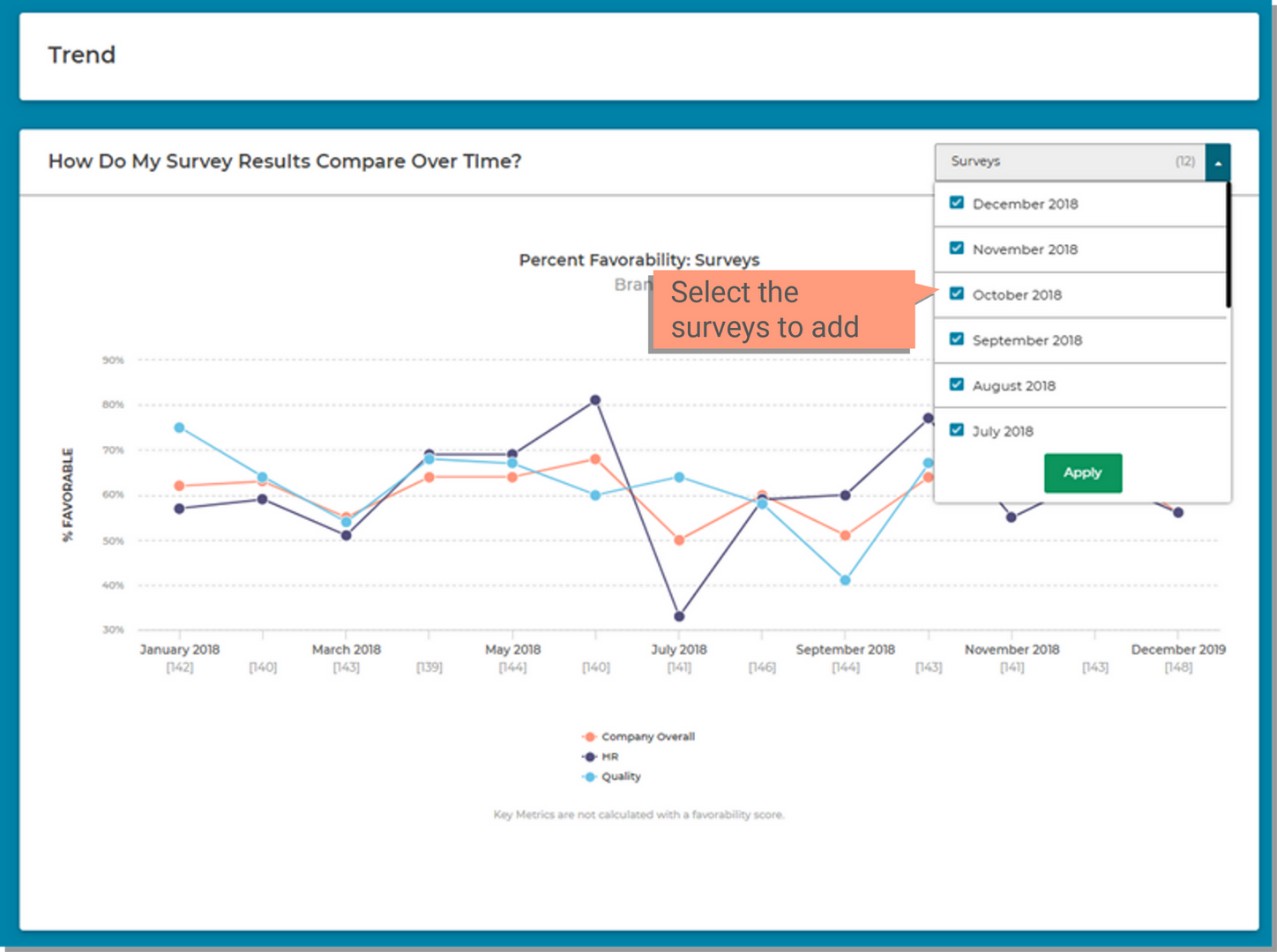
Trend allows you to see how your Percent Favorable scores change over time. By viewing the percent of people who responded favorably over time you can see if your action plans are successful or if you need to make adjustments.


Before you begin...

  • Watch a video overview of the Trend Chart page.

   VIDEO OVERVIEW

Page Overview


Scores Filter

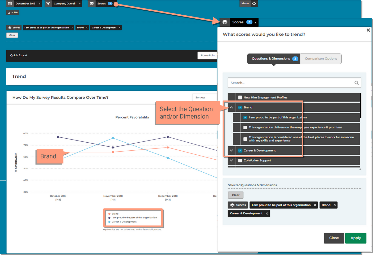
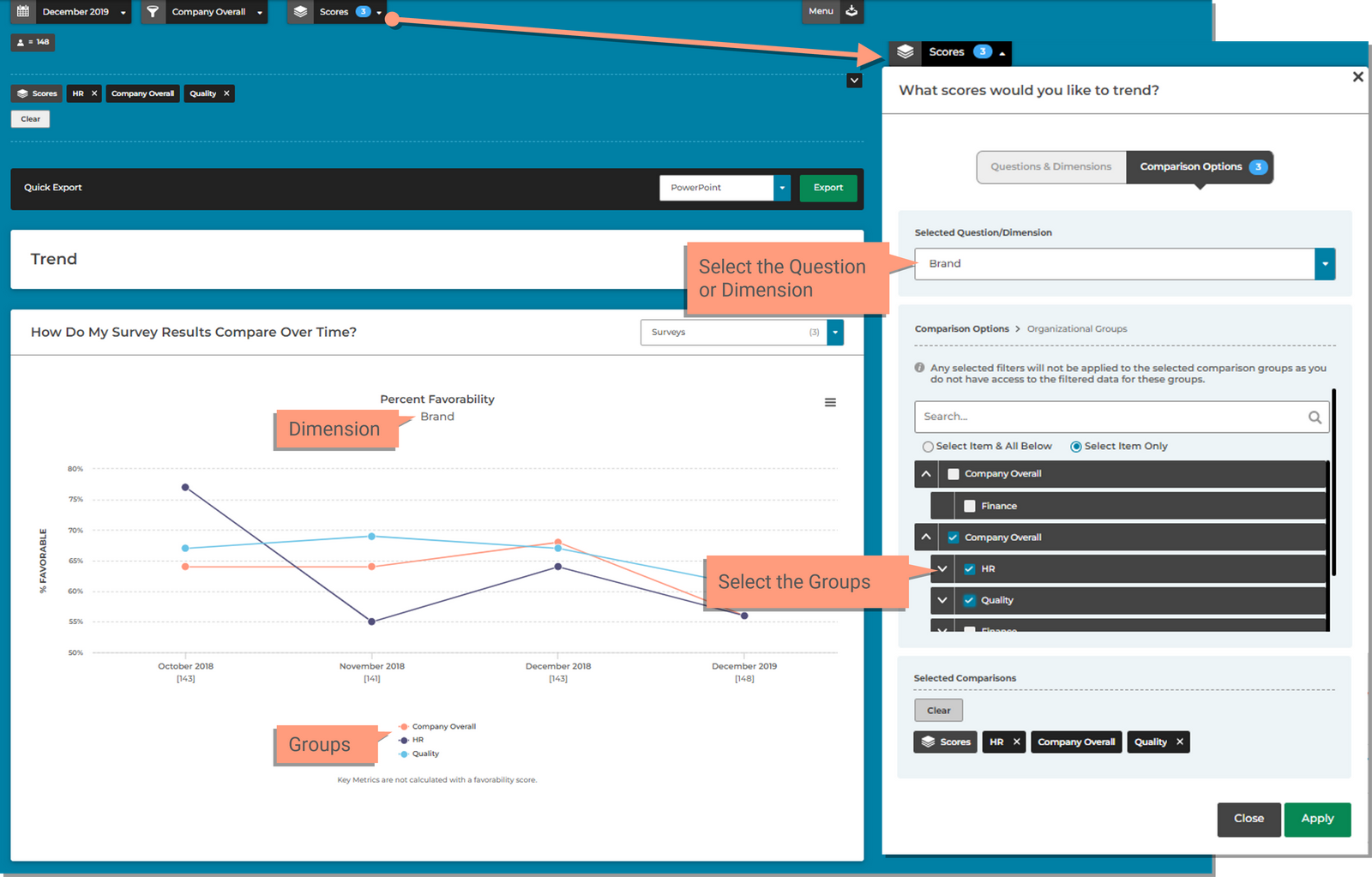
Use the Scores filter to populate the chart with either Questions & Dimensions or by Comparison Groups.

Questions & Dimensions

This will show the percent favorable scores for each question and/or dimension selected. The question or dimension will be represented as a different colored line within the chart.

  1. Click the Scores filter
  2. Use the Down Arrow next to each dimension to expand the dimensions and view the questions
  3. Select the Dimensions and Questions you would like applied in the chart
  4. Click: Apply


Comparison Groups

Comparison Groups will show the percent favorable scores for each group in your organization selected. The groups will be represented as a different colored line within the chart.

  1. Click the Scores filter
  2. Click the Comparison Groups tab
    • If you've previously made selections in the Questions & Dimensions tab, you will first need to click the 'Clear' button at the bottom before making selectings in the Comparison Groups tab.
  3. Select the Question or Dimension you want to see the trend for from the dropdown.
    • You can only select 1.
  4. Select the Groups you would like to compare. Use the Down Arrow next to each group name to expand for more groups.
  5. Click: Apply


Surveys Selector

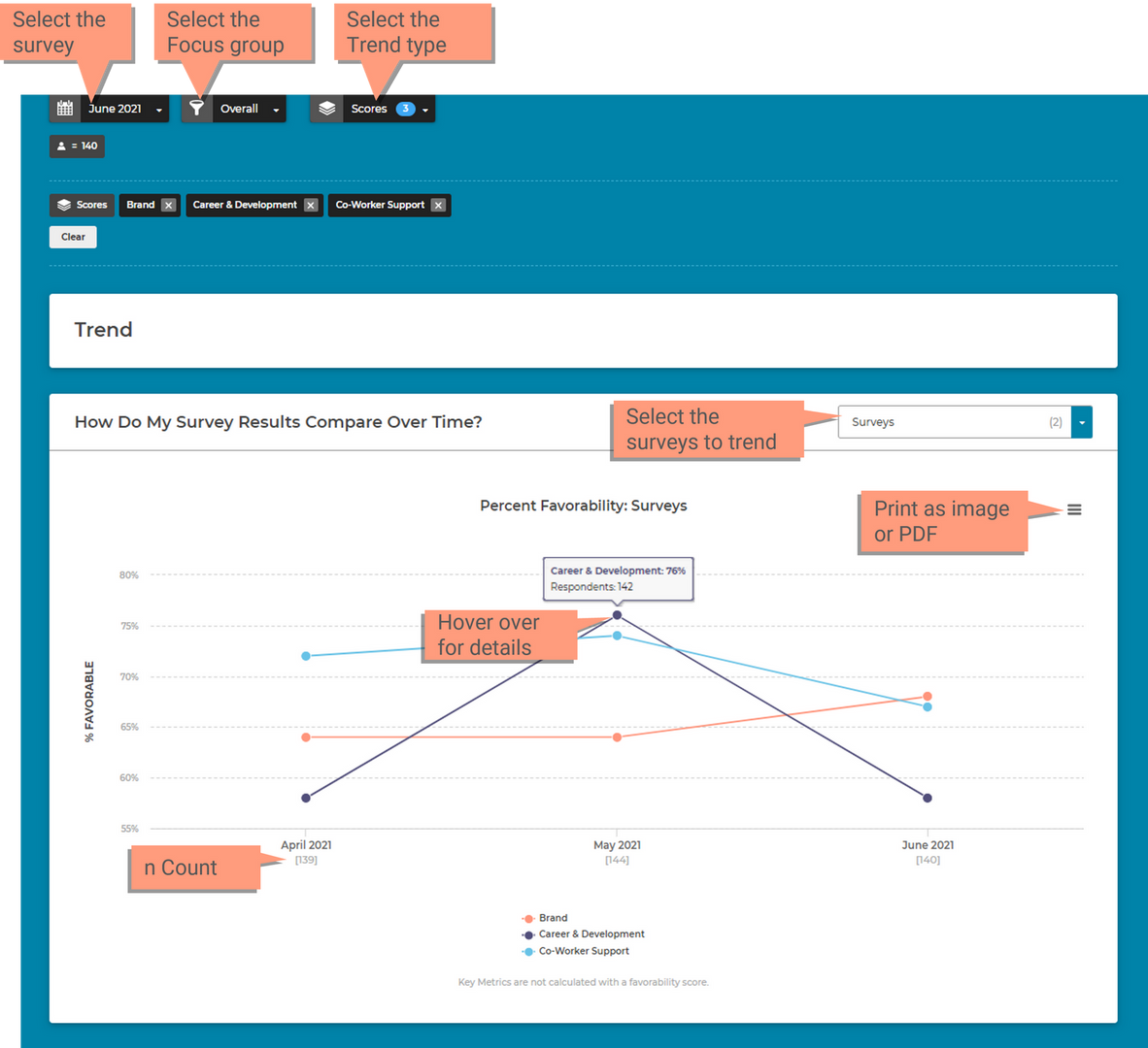
The survey selector will allow you to choose multiple surveys to compare across time. This will show how your scores have changed for each survey.

  1. Click the Checkbox for each Survey you want added to the chart
  2. Click Apply