Heatmap allows you to visualize the data for patterns using color to emphasize relationships between data values. This will help you understand what’s unique, detect trends and assist you in deciding where you should focus your attention in just a few clicks.
Heatmap requires multiple selections to populate the map. Here are some screenshots of each tool to help you navigate the instructions below.

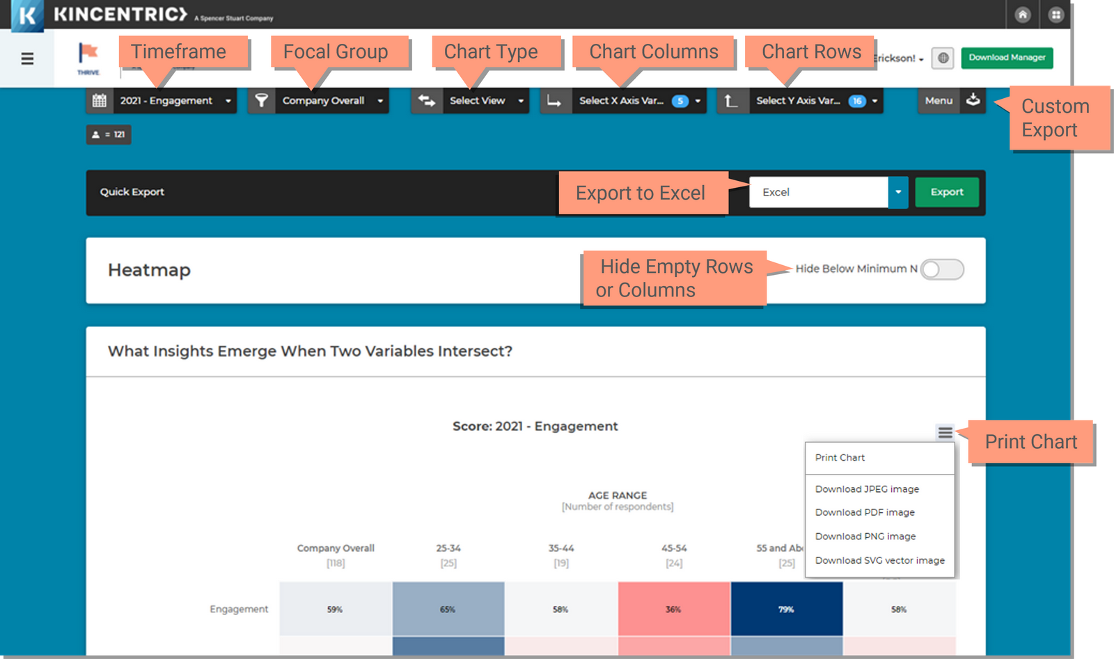
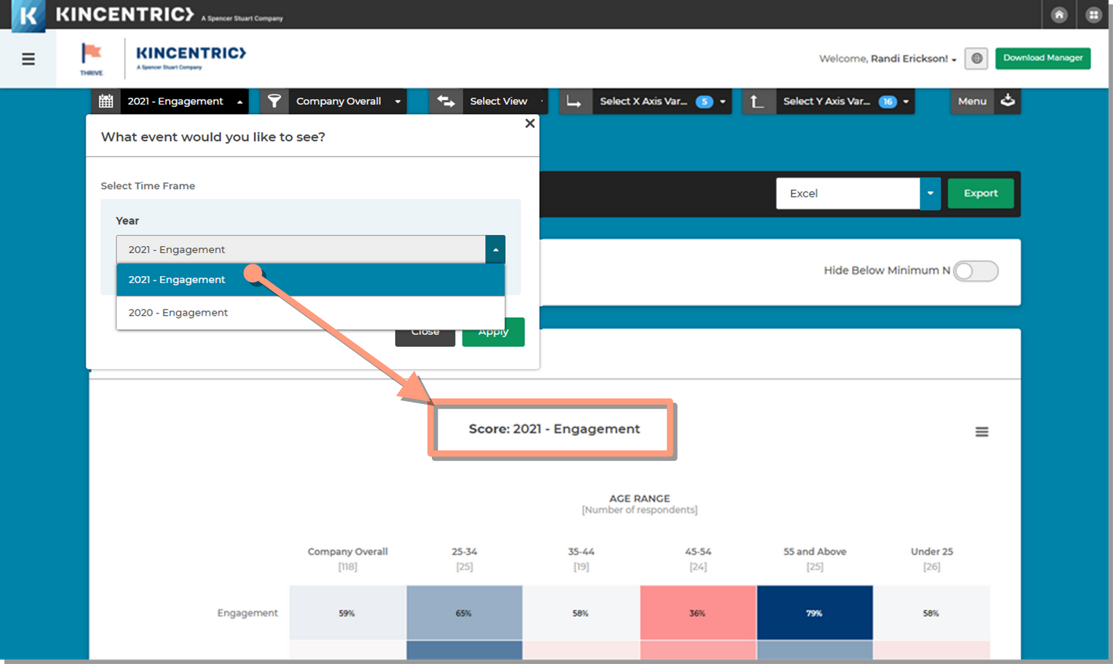
Select the survey event you want in the chart.

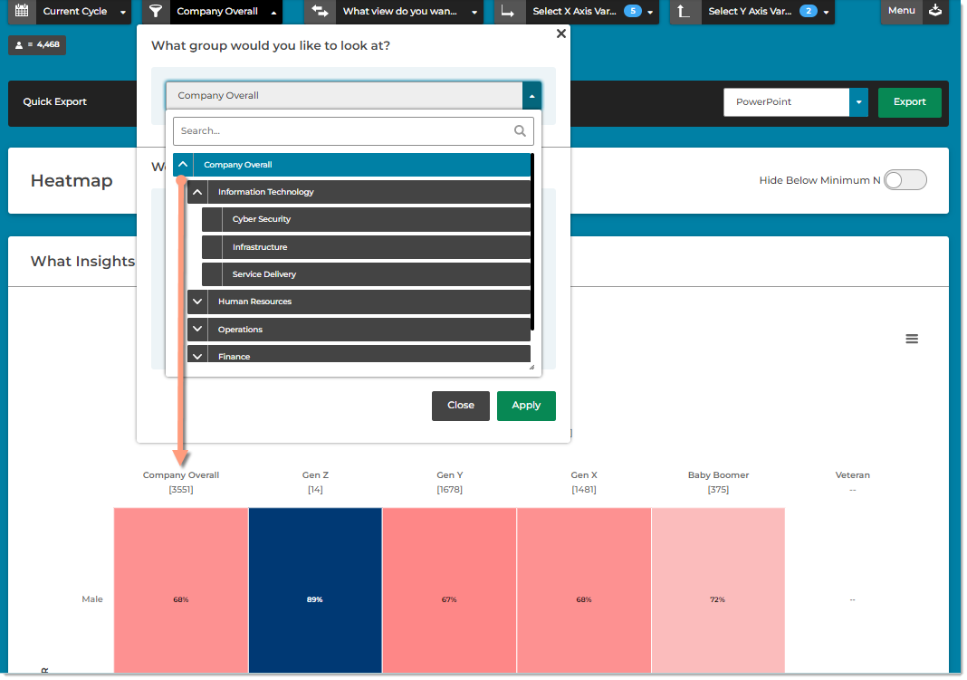
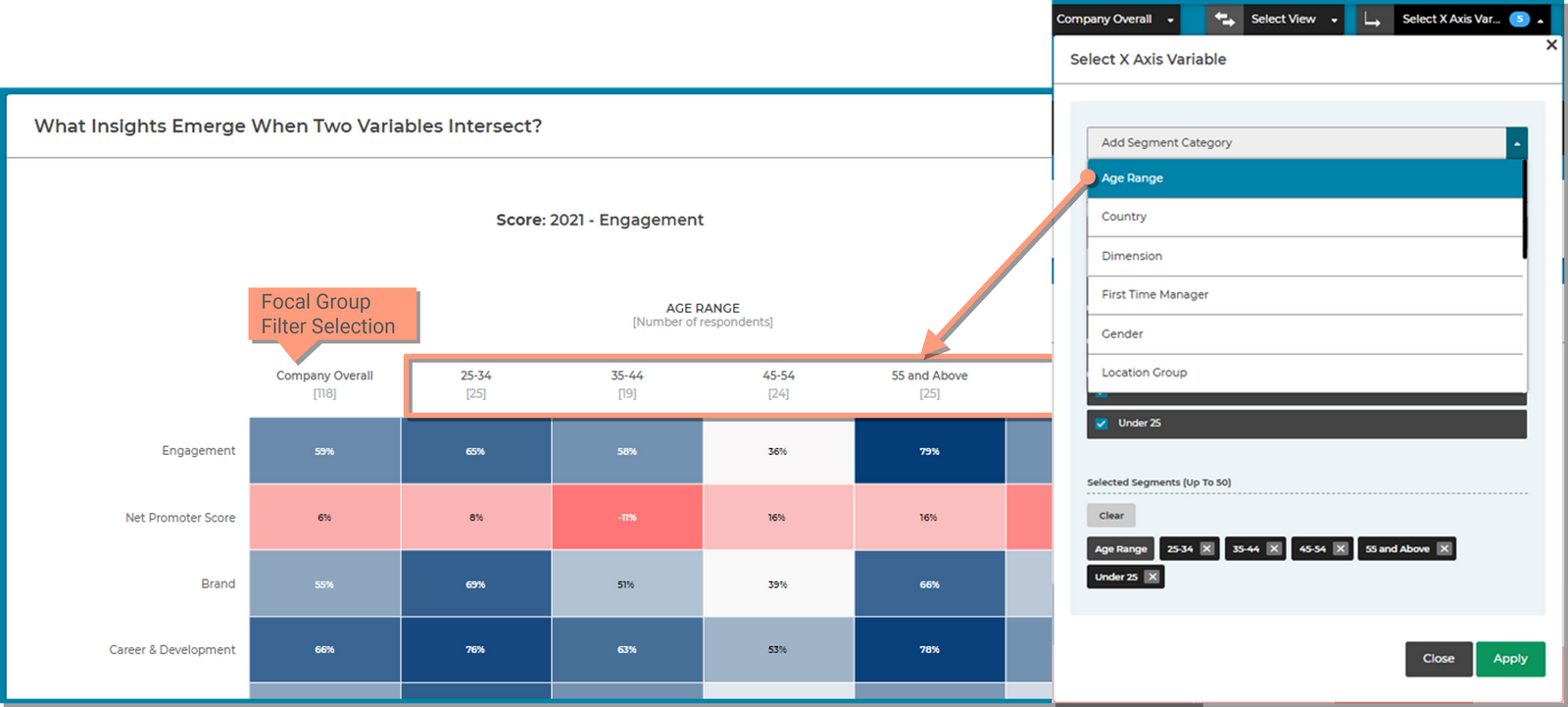
Select a focal group and filter by demographics or hierarchies.

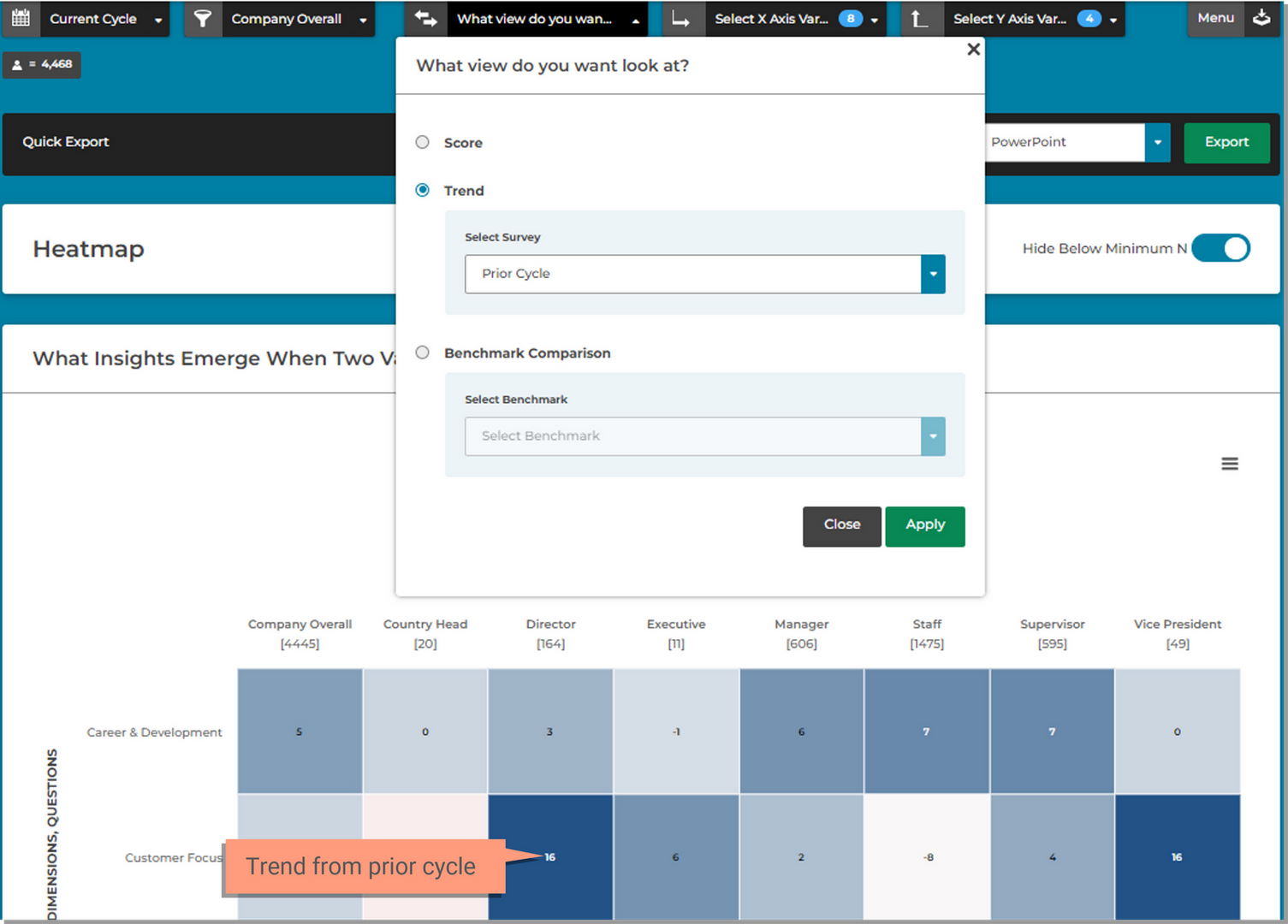
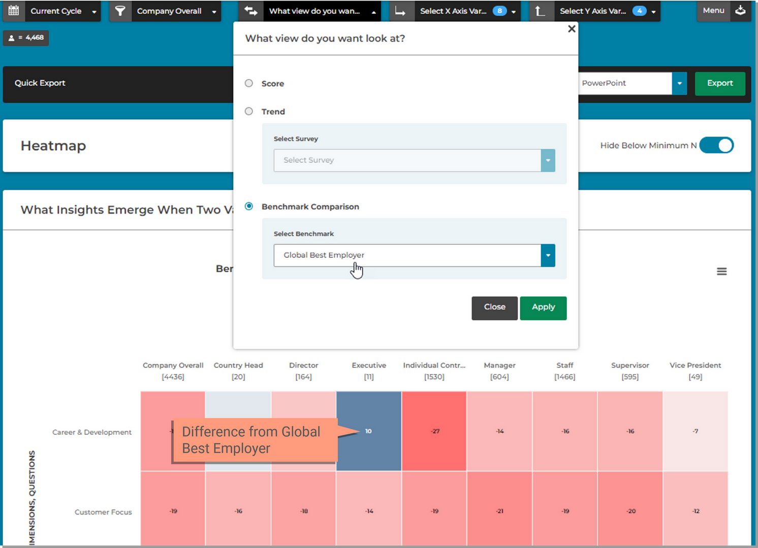
Choose the scores for the event or score the difference from trend or a benchmark.

Choose the demographic views you want in the columns (X Axis) of the chart.

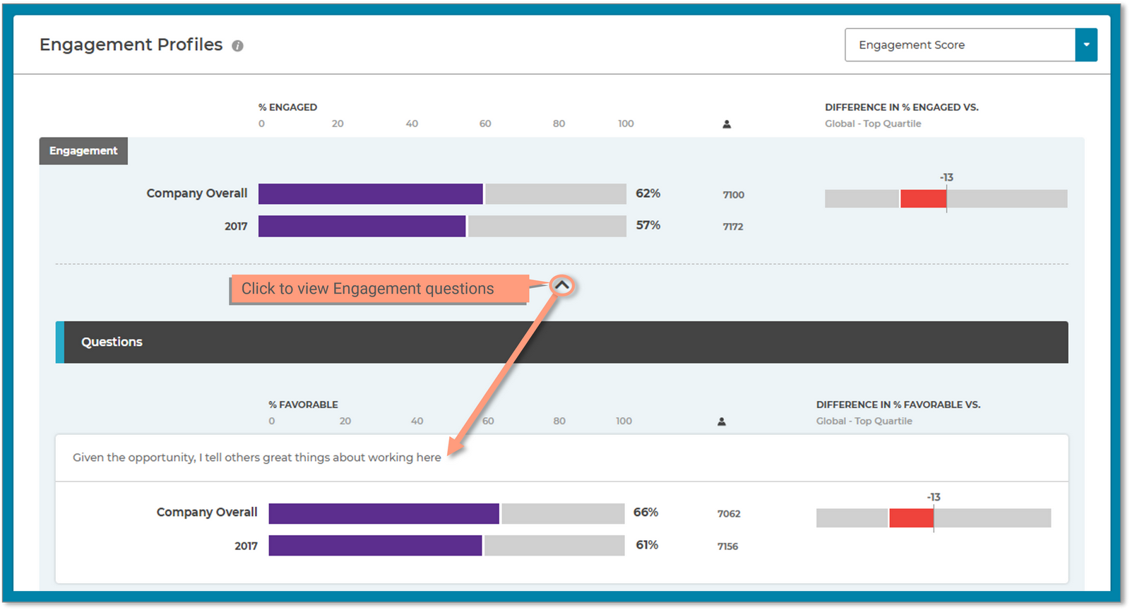
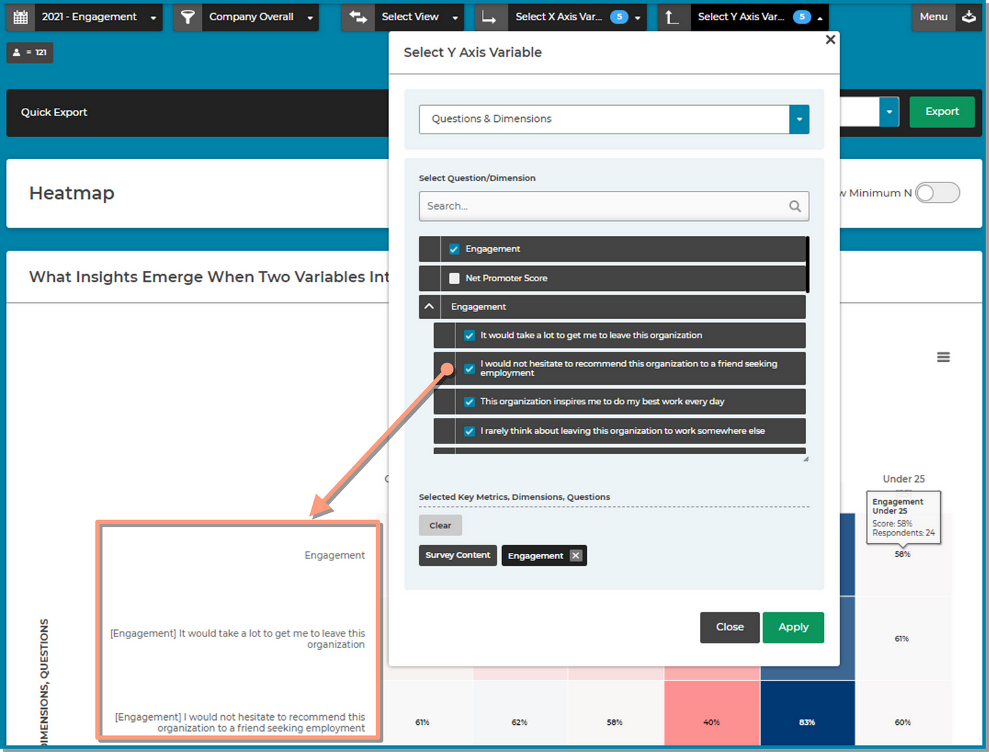
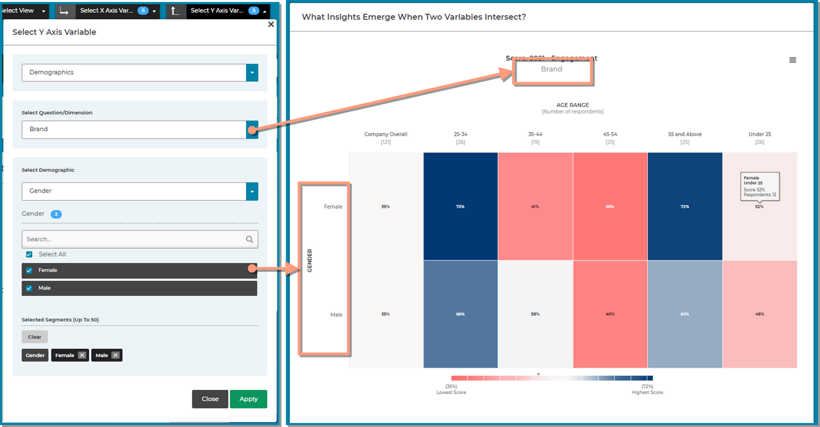
Choose the questions, dimensions or demographics you want in the rows (Y Axis) of the chart.

Export to PowerPoint.
Build a meaningful Heatmap using the different filters and options available to you.
The Timeframe filter allows you to select from the survey's you have avalable. The most recent survey (Current Cycle) is selected for you and will display the data for the selected survey in the Heatmap.
The Focal Group filter allows you to select the group to compare all other groups to or all other demographics to. This group will always appear as the first column in the heatmap.
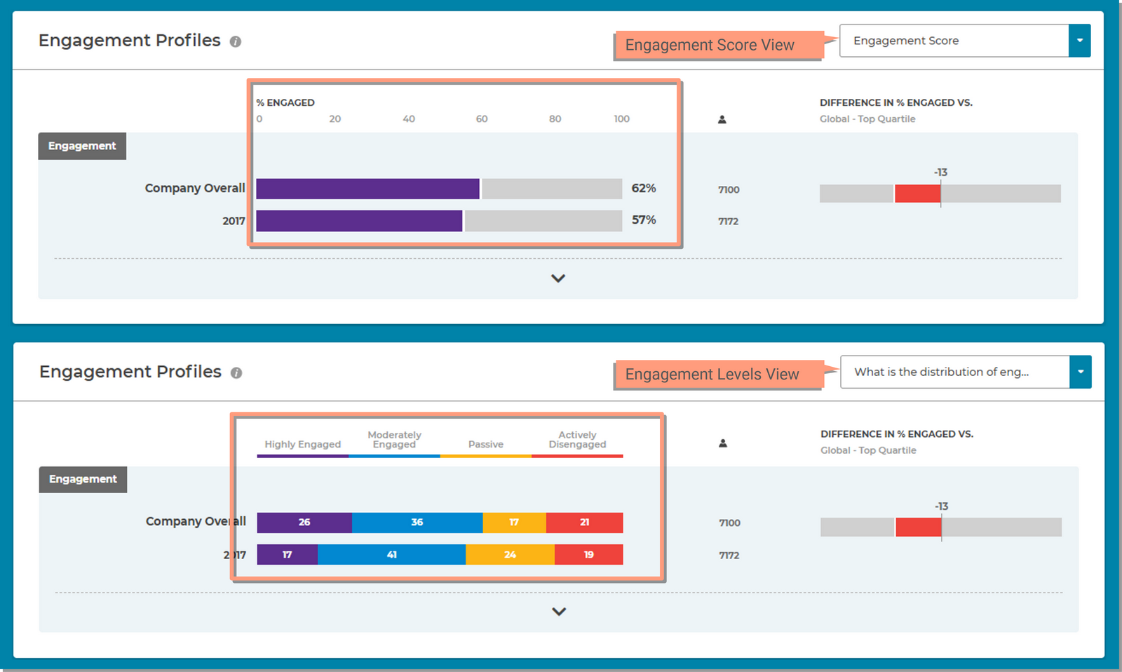
The Select View filter determines what data is displayed in the chart.
Displays the % Favorable score and is the default selection.
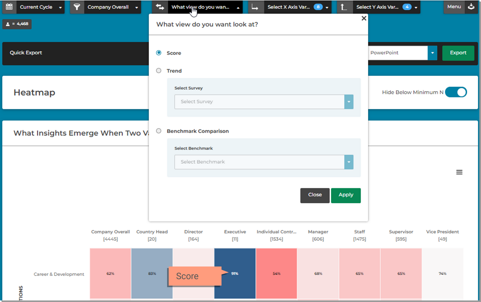
Displays the difference in percent favorable score compared to a previous survey.
Displays the difference in your scores compared to industry standards.
The X Axis Variable defines the data you want to appear in the Columns of the chart in addition to the selection made in the Focal Group filter.
The Y Axis Variable defines the data you want to appear in the Rows of the chart.
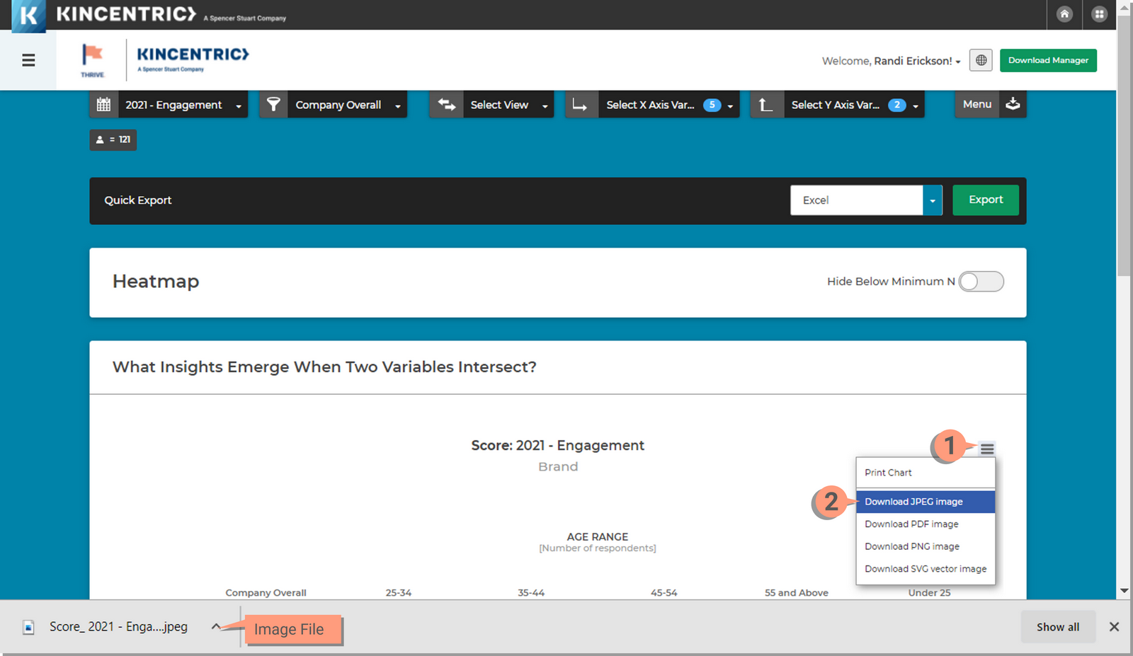
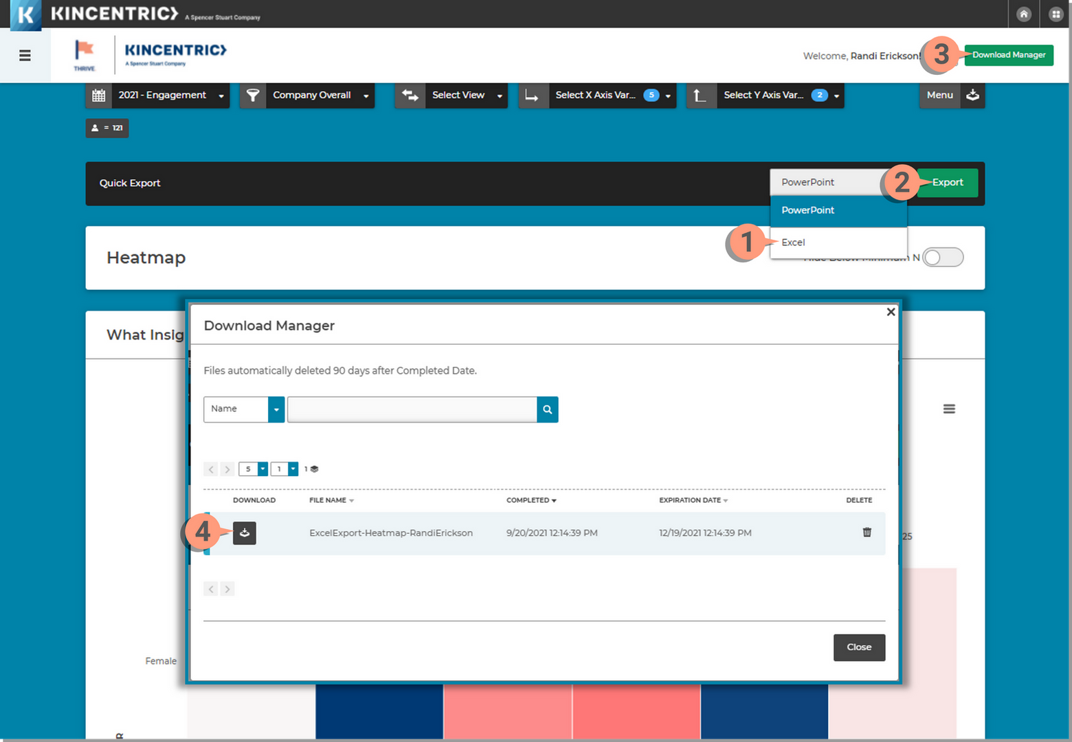
Quickly export the data selected on the page using the Quick Export (Excel) or download the chart as an image to add to PowerPoint presentations.
Exporting to PowerPoint from the menu icon will allow you to export using standard custom options. It does not export Heatmap specific slides, but an overall summary of your results. Download images of heatmaps and add additional slides with the heatmap images if desired.
Use the Quick Export banner to export the data to Excel using all the existing selections you've made on the page.
Download the chart as an Image to insert into a PowerPoint presentation or Word document. You can also export to a PDF Image.