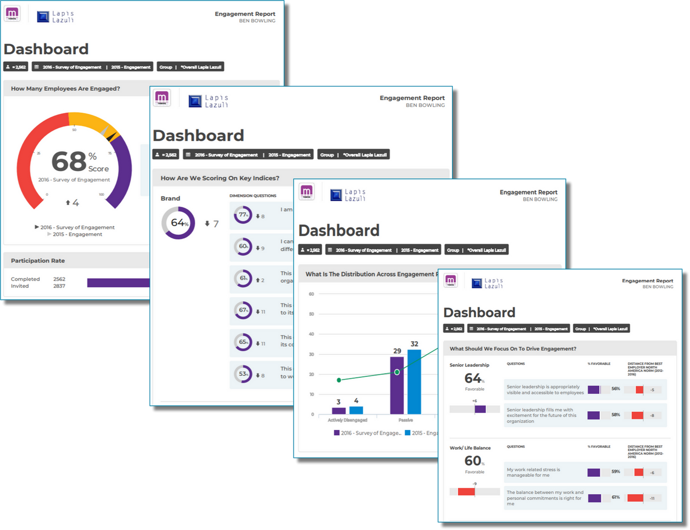
The Dashboard provides a compacted view of your scores in various ways all on one page.
The Dashboard is comprised of 5 possible sections depending on your company configuration.
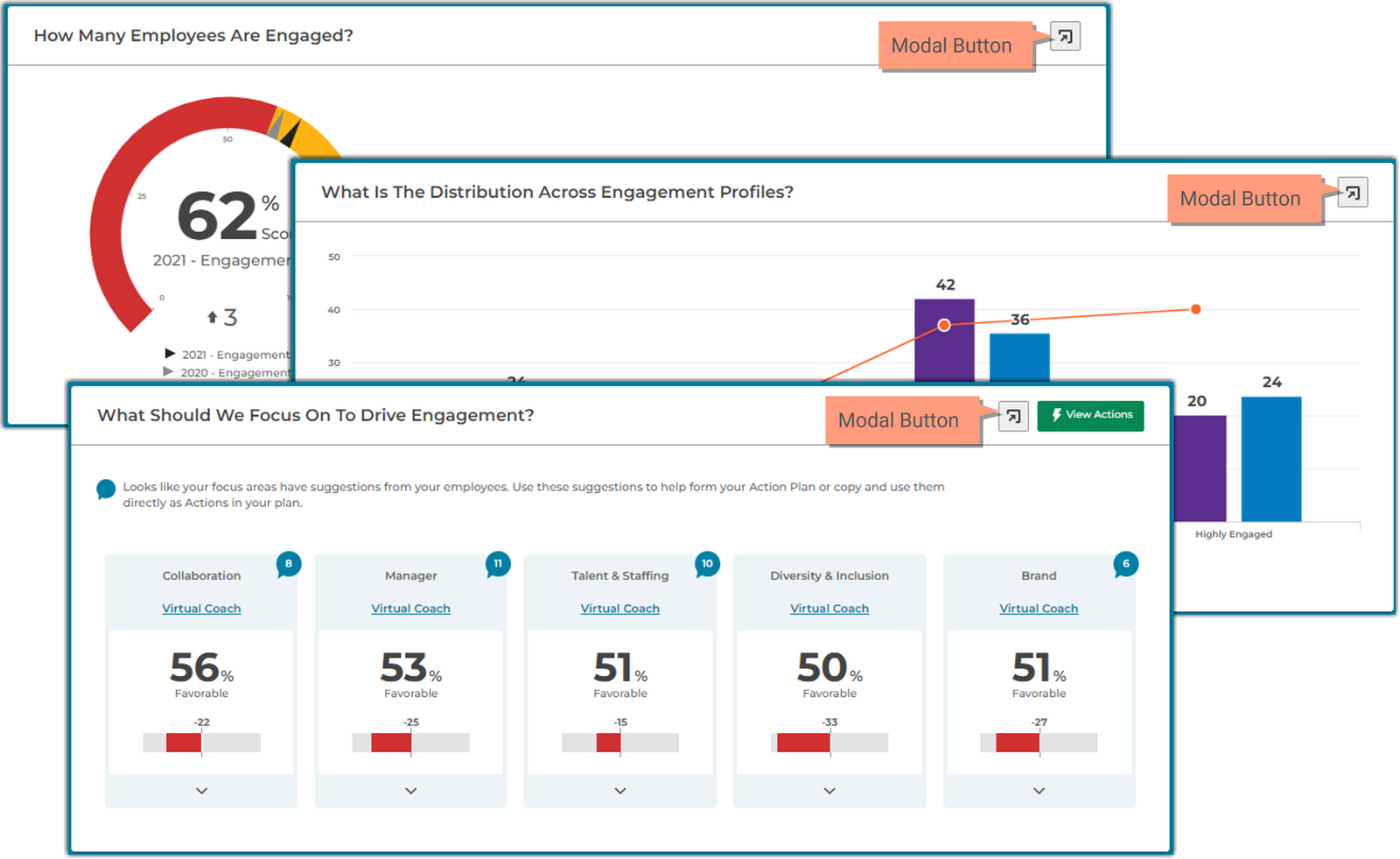
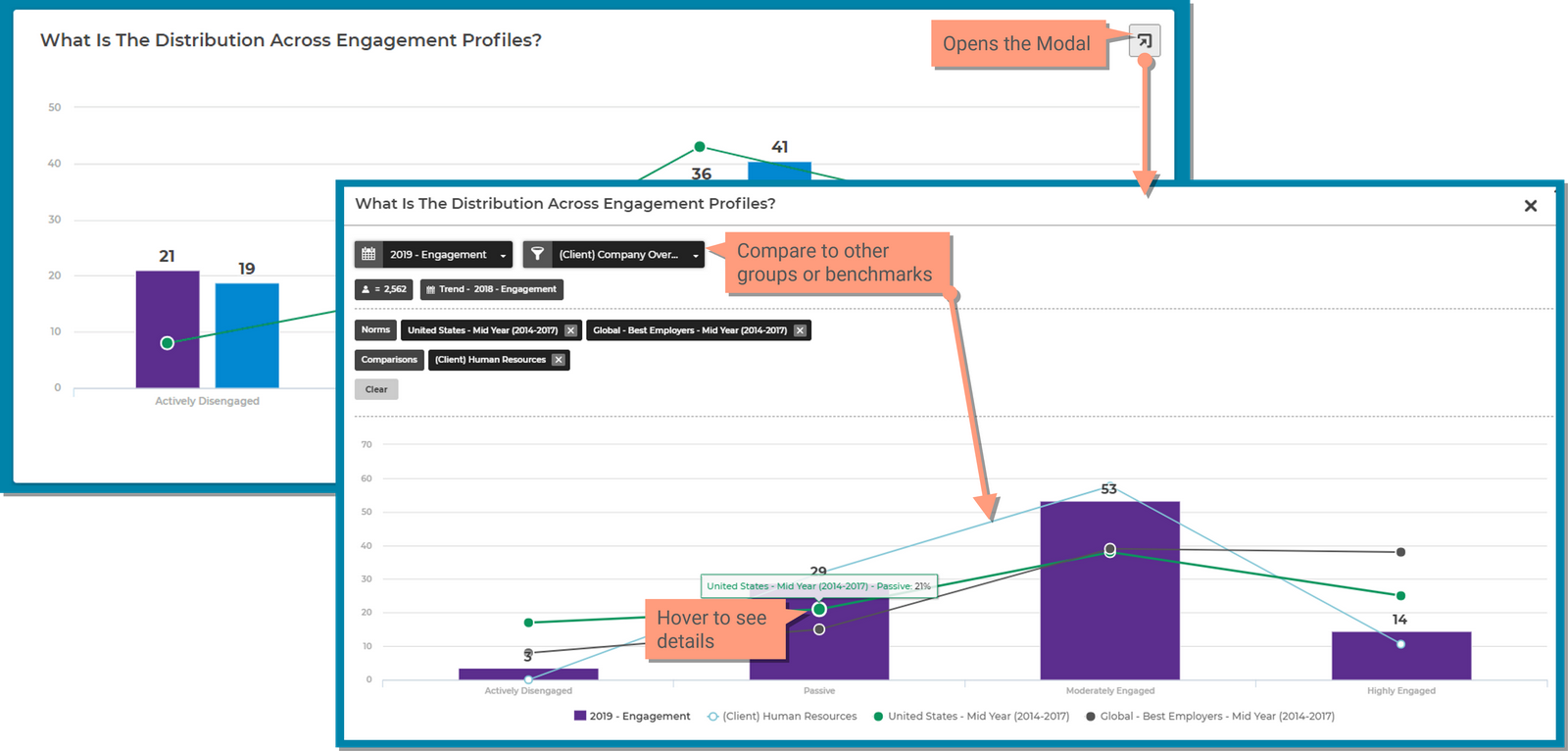
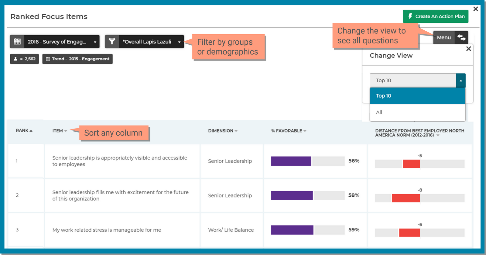
Many sections have a modal button that expands a popup area with additional filters and comparison tools allowing you to explore the data further. This feature is available in the following sections of the Dashboard page;
Explore the different sections of the Dashboard page.
Depending on your company requirements, you may not have access to all sections.
The score for this section is different for each application.
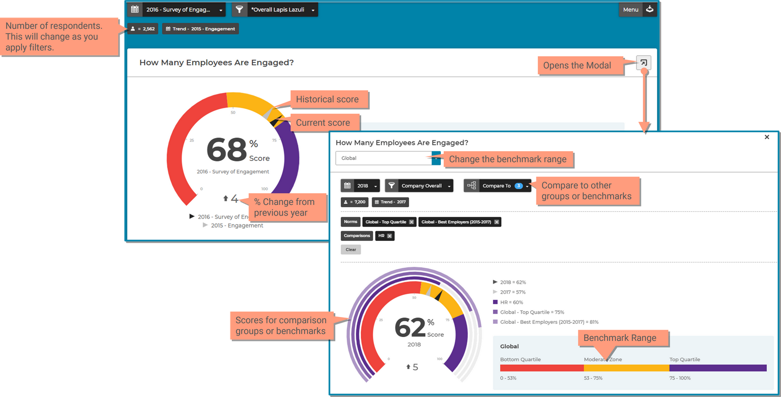
The Score section displays your survey score (black pointer on the dial) compared to previous years data (grey pointer on the dial) set within a range (Bottom Quartile, Moderate Zone, Top Quartile). The benchmark data that is available is pre-determined by your Kincentric project team.
This section is referred to as the Score Dial and provides a view of your score and how you’re trending to previous years (if applicable). It also displays where your score falls within the standard benchmark range (Bottom, Moderate, Top).
Use the popup modal to explore the results by clicking the Modal button. The modal is your scratchpad for exploring results, the selections within this modal do not save or change the data selected on the dashboard page. Compare your scores to other groups, demographics, and industry benchmarks.
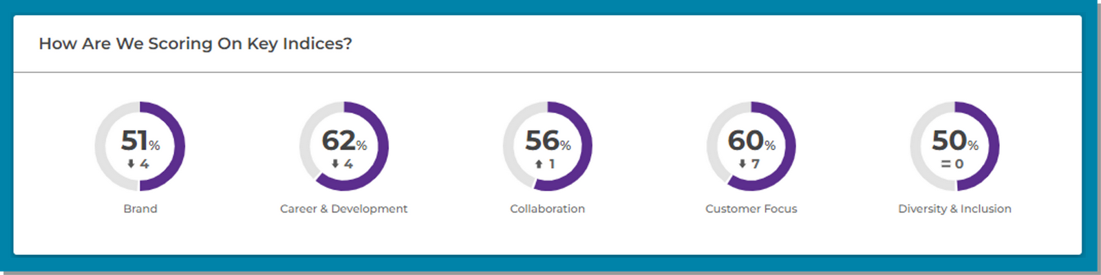
The index summary section allows you to see shows a summary of key indices or dimensions that are important to your organization. Please note, this may or may not be applicable to your organization.
The distribution chart displays your engagement scores in a chart view with one benchmark displayed so you can view your current score, how you’re trending and how you compare to industry benchmarks.
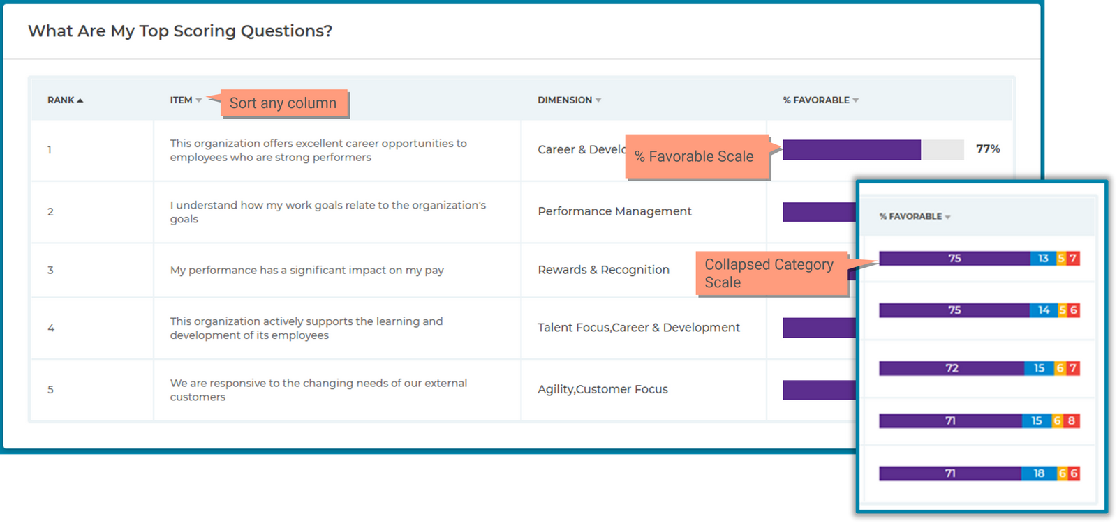
This chart takes the top scoring questions from the survey and lists them in ranking order.
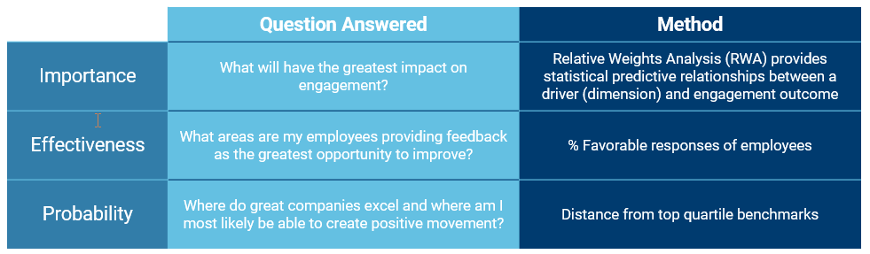
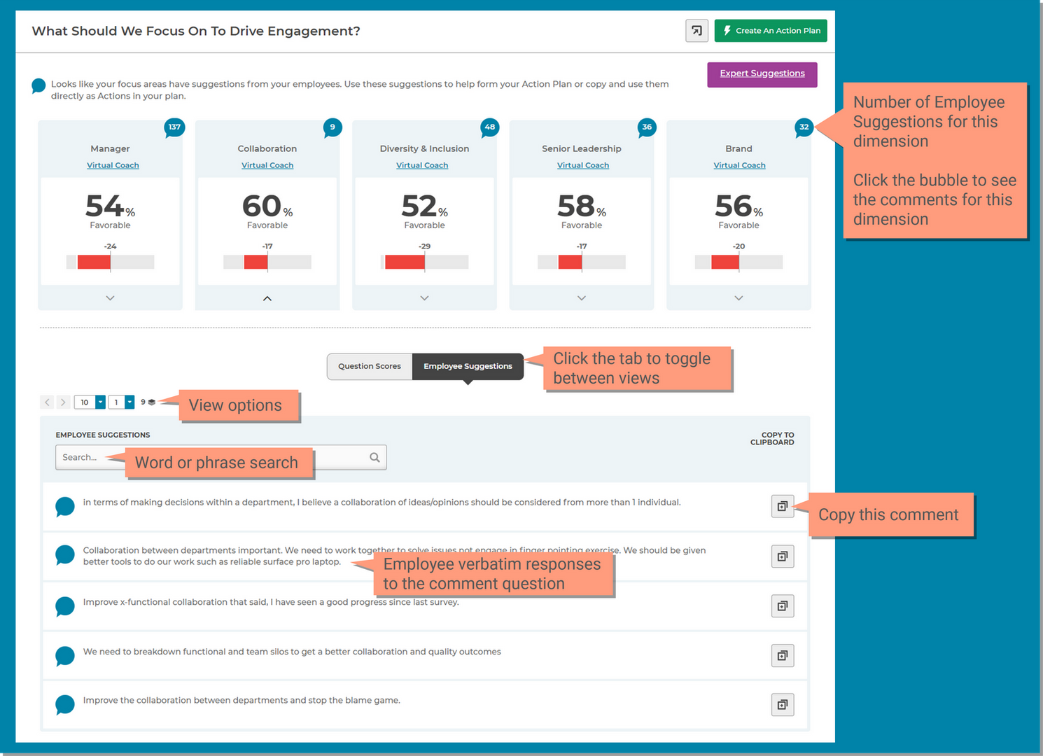
The focus area helps you prioritize actions to address the issues that most impact your employee's engagement on the subject. This section shows the top 10 items and their corresponding dimensions, as determined by Kincentric's Relative Weigh Analysis (RWA3) methodology, that will have the greatest impact on scores if perceptions were improved.
Kincentric’s proprietary prioritization analysis (RWA3) makes it simple and easy to move from data to action. We prioritize action based on:
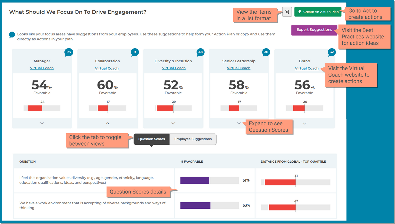
Employee Suggestions may be available to you if you asked an open-ended comment question on the survey. This feature shows you how many comments included suggestions with the following key words and had 6 or more words in the comment:
Capabilities include;
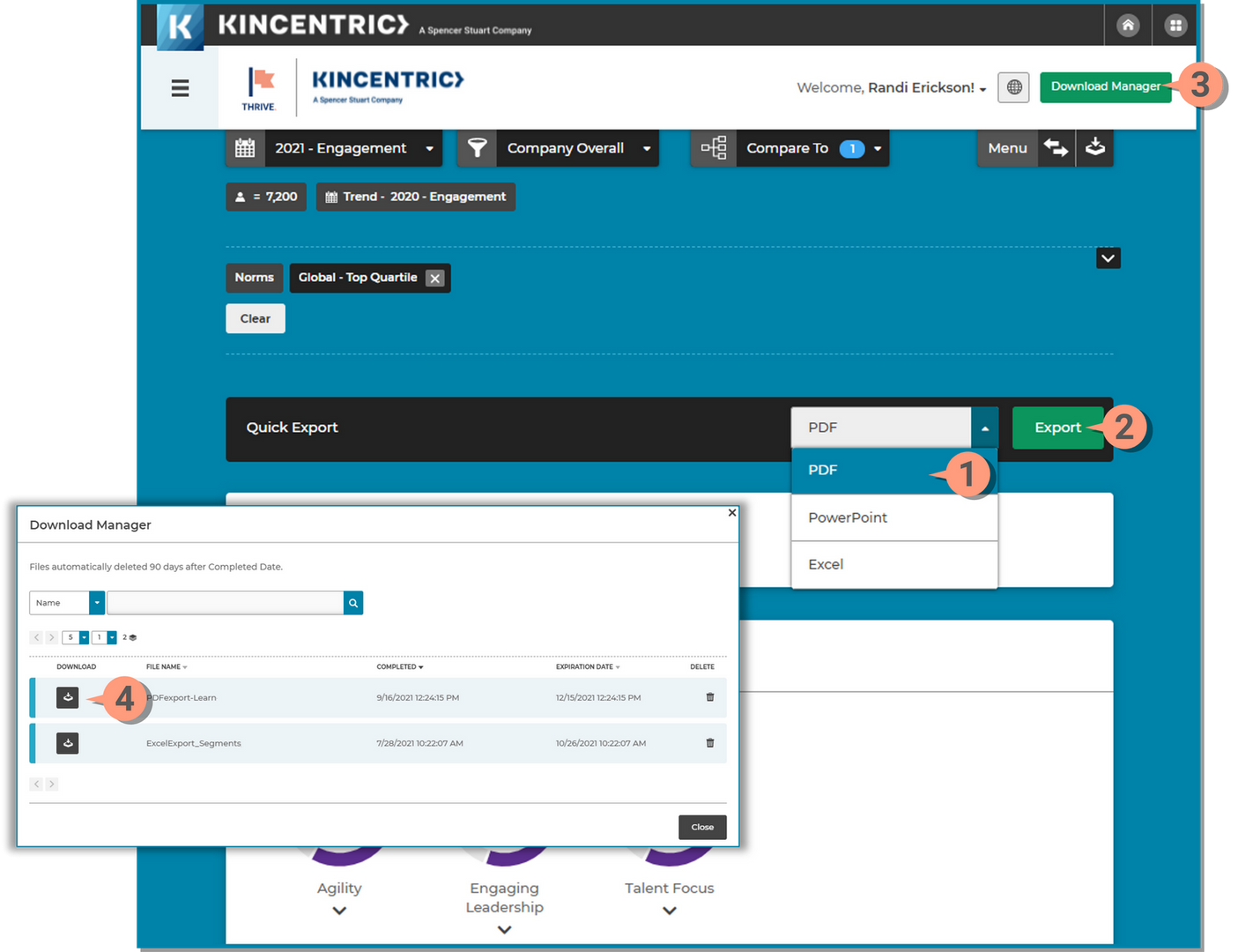
You can quickly download the dashboard in a PDF format with your current filter selections, however the PDF will only show the top 10 focus items. For a detailed overview of all the downloading options, visit the Download page.