Segment Charts

Explorer Segment allows you to visually explore the results of your engagement survey using charts. Drill into the data by different segments and filter on specific demographics instantly.

Before you begin...

  • It’s helpful if you understand how to use all the filtering tools. Reference the Filtering & Comparing page for a detailed overview.
  • If you want to download your results, visit the  Download Results page for a comprehensive overview of how to download in Excel, PowerPoint, or PDF.
   video Overview

Score | Distribution

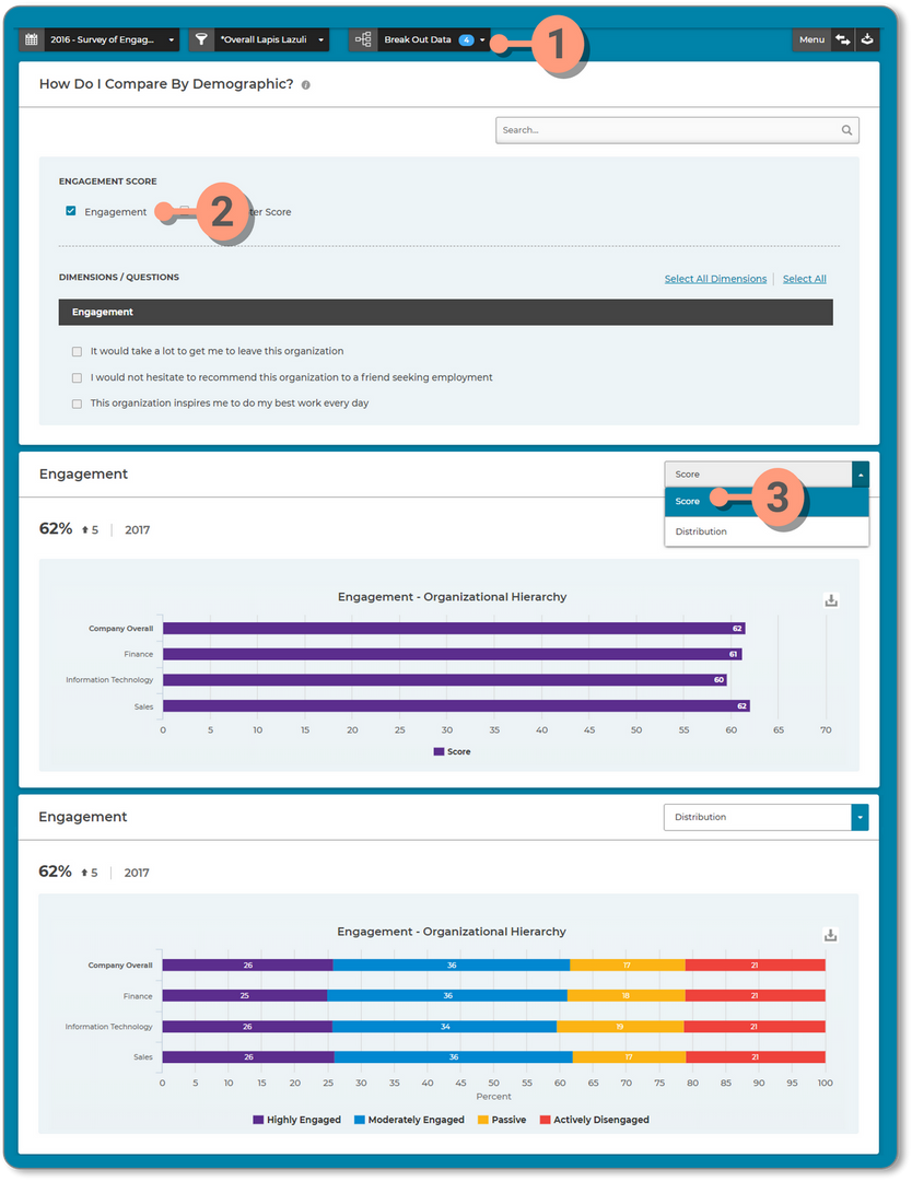
In most cases you will see two options in the Score chart.

  1. Distribution : Displays scores grouped into categories associated with the survey. 
  2. Score : Displays the overall score

To see the Score/Distribution;

  1. Use the  Break Out Data  filter to select the groups or demographics you want included in the chart
  2. Check the  Box  in the Score section
  3. Use the  drop down selector within the chart  to view either the Score or Distribution


Dimensions & Questions

This section displays all the questions on the survey grouped into dimensions. There are several options for selecting charts:

  1. Search: Allows you to search for specific text
  2. Check Dimensions and Questions individually by clicking the box next to the desired item.
  3. Select All Dimensions: Selects and displays all the charts for Dimensions.
    • When this option is selected, a 'Deselect All Dimensions' option will appear allowing you to automatically clear the selections.
  4. Select All: Selects and displays charts for all of the Dimensions and Questions in the list.
    • When this option is selected, a 'Deselect All' option will appear allowing you to automatically clear the selections.

Chart Functionality

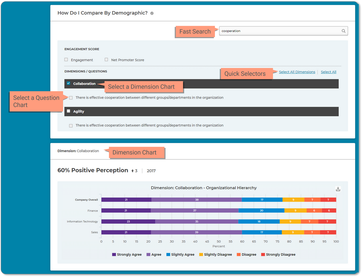
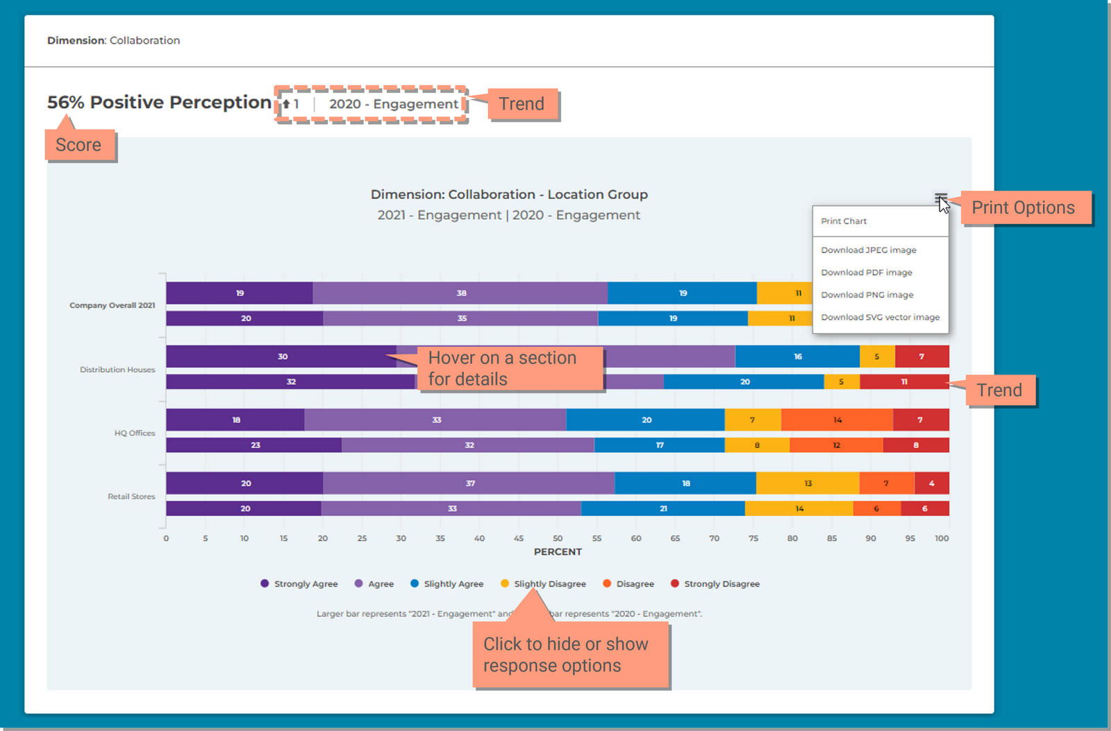
Charts are Interactive, you can change the chart type and click within the chart to print, hide or show response options and hover to see the details.

  1. Print: Save a copy of this chart. If you want to download an entire page of charts, review the Download Results page for instructions.
    1. PNG: .png image
    2. JPEG: .jpeg image
    3. PDF: Save it as an Adobe PDF file.
      • When PDF is selected, the results will vary based on your browser settings. In some instances it may open in another tab in your browser window (Chrome) or the browser may ask you what you would like to do such as Open or Save the file (all other browsers).
    4. SVG Image: Vector Image
  2. Hover over the bar to see the details.
  3. Hide or show response options by clicking on the option in the legend.


Chart Options - Filtering the Group

The initial default chart will contain the organization that is selected in the Filter Selector tool.

  • When you make selections in the Filter Selector, it will be represented in the chart with a filter icon next to the Group name.
  • There will also be an indicator in the chart title defining the filtered criteria.

Chart Options - Using the 'Break Out Data' tool to add groups or demographics

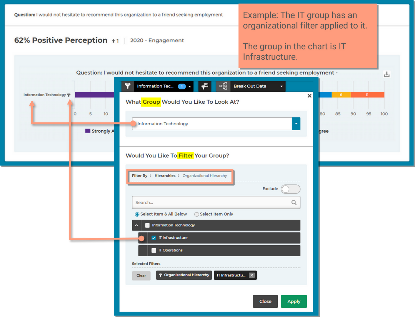
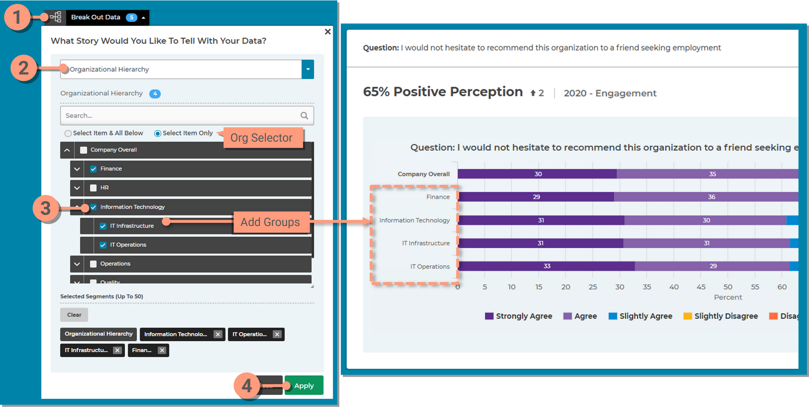
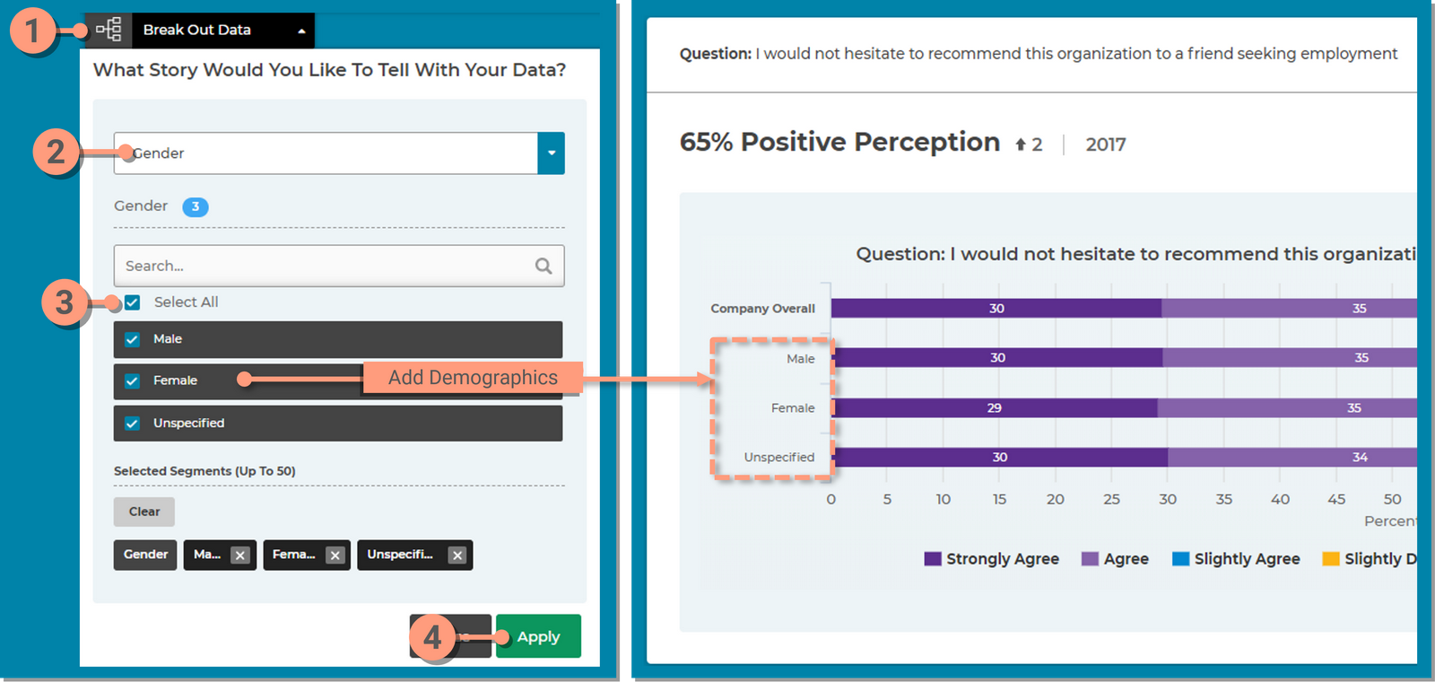
Once you have selected the group you want to focus on using the Filtering Selection  tool, you can add other groups or demographics to the charts using the Break Out Data  tool.

Add 'Groups' to the chart

  1. Click the  Break Out Data  tool
  2. Select  Organizational Hierarchy  from the  Add Segment Category  drop down
  3. Select the  desired groups  (up to 50)
    1. Use the  Org Selector  to automatically select all the groups within the top organization
    2. Use the  Search box  to find a group quickly
  4. Click  Apply


Add 'Demographics' to the chart

  1. Click the Break Out Data tool
  2. Select a  Demographic  from the Add Segment Category drop down menu
  3. Use the  Select All  or  Check the box  for the desired demographic (up to 50)
    • You cannot select different demographics at one time, you are limited to only one. Example, you cannot select Gender and Age. Only Gender or Age.
  4. Click Apply


Chart Options - Changing the Chart Type

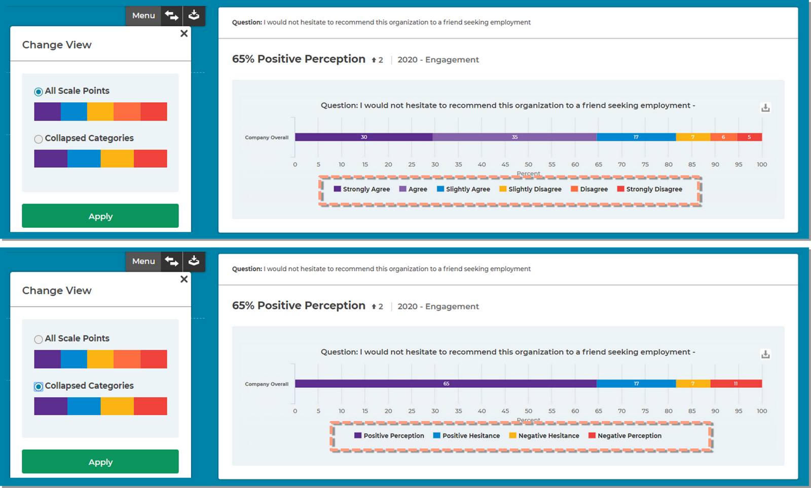
Some users may have the Bar Graph selector within the Menu tool at the top right of the screen. 

This will allow you to change the chart type view from the default of All Scale Points to the Collapsed Categories. The collapsed categories graph combines response data into groups.
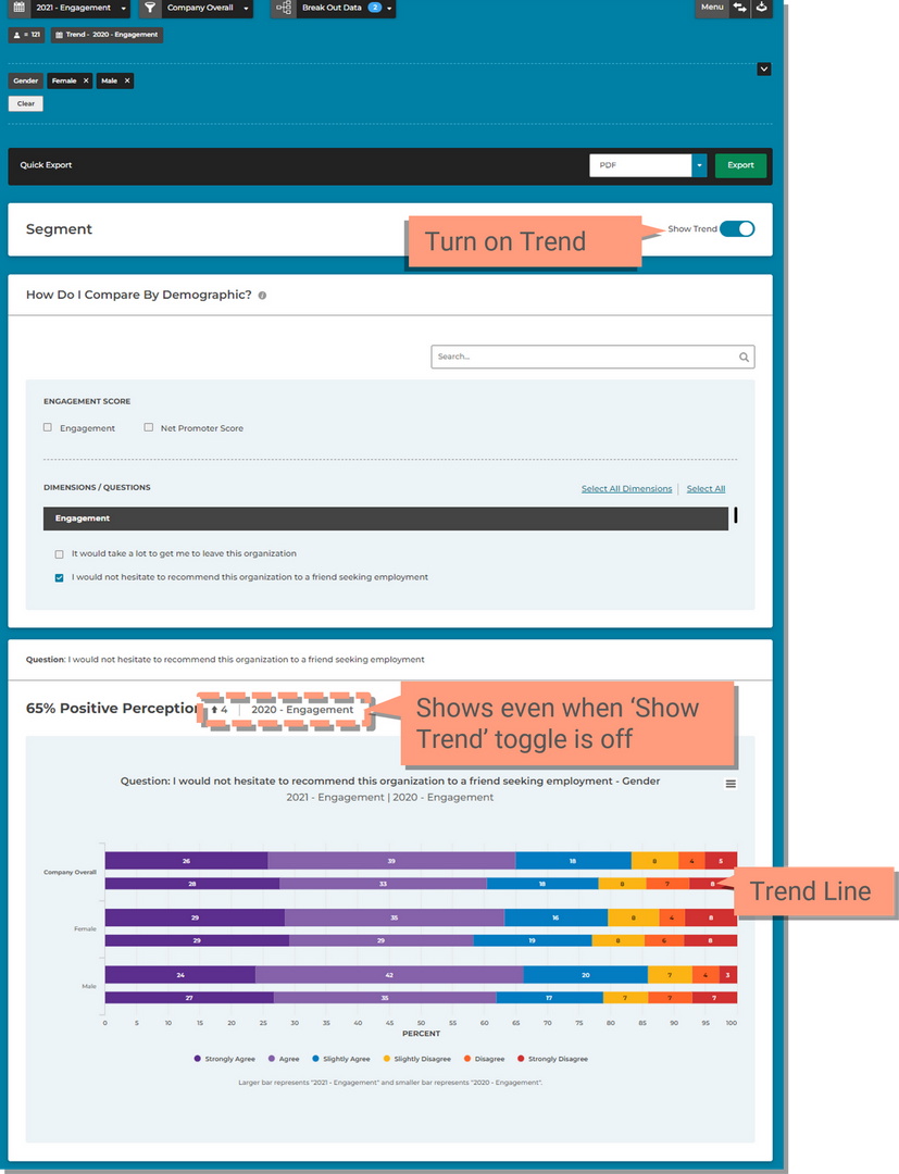
  • Simply select the desired chart view.